10 ways to make your hallway and staircase appear bigger without extending your property

The hallway sets the scene for the entire home, but creating a welcoming entrance can be easier said than done.  

Hallways and staircases can be difficult areas to address, especially if they are narrow, awkwardly shaped or lacking in natural light. Add in the fact that these high traffic areas often become dumping grounds for coats, bags and shoes and it is no surprise that even the biggest spaces can easily appear small and cluttered.

The good news is, there are easy changes you can make to create an illusion of space in these tricky areas, as we discovered when we spoke to four experts in the interior design world.

Meet the experts

Vicky Tallon

vicky-tallon

Interior designer

Tallon Perry Interiors

Elaine Penhaul

elaine-penhaul

Director

Lemon and Lime Interiors

Emile Azan

emile-azan

Interior designer

Chameleon Designs

Semsettin Karahan

semsettin-karahan

Architectural designer

Zanoply

Here’s what they had to say…

1. Colour

Elaine: There are lots of ways to create the illusion of space. An easy and simple way to do this is in a small hallway is to freshen the area up. A lick of paint in a bright light colour will make a huge difference.

Vicky: By keeping the floor darker than the walls and staircase, our eyes are immediately drawn upwards towards the lighter areas, giving a sense of more space.

Emile: The best way to create the feeling of light and space is to use contrasting colours. Use two colours - a lighter colour on the walls and choose darker coloured woodwork. Using greater amounts of the pale shade and less of the dark will make the space feel bigger and more airy. Alternatively, painting your hallway in a strong colour creates a sense of drama, and each time you go through a darker hall into the rooms beyond, the eye is tricked into believing the rooms are really big and light.

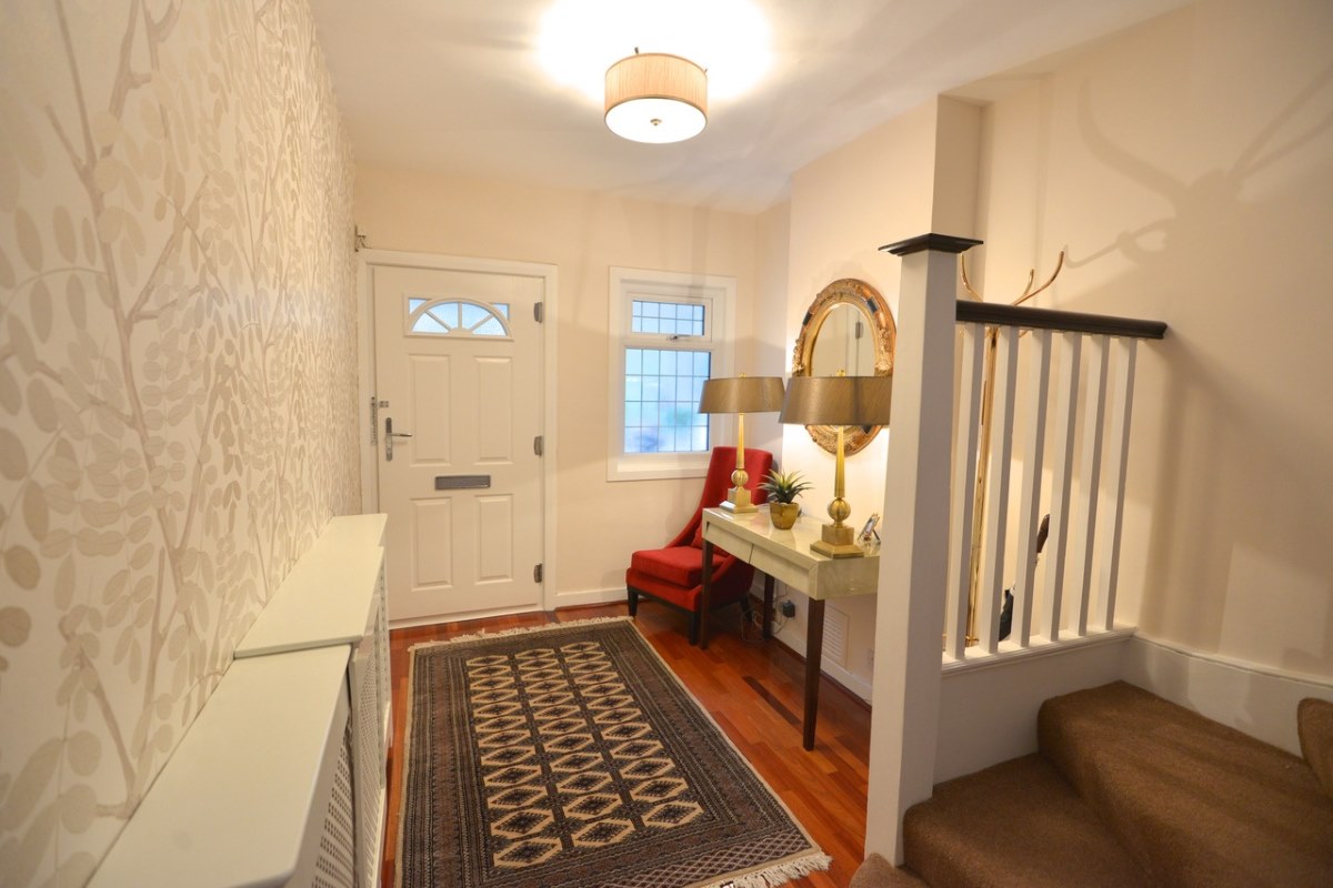
As transient spaces, hallways are ideal for playing with pattern. You can choose a bold wallpaper that you wouldn’t necessarily want to live with in another room where you spend more time. You can use extravagant wallpaper in high traffic areas without fear of damage by papering above the dado and painting below. That way scuffs or marks can simply be painted over. I like to lower the dado, at around 70cm. It is a much more contemporary look.

Semsettin: It goes without saying that pale colours and tones will help refract natural daylight to make your hallway appear larger. In a white room, a dark timber staircase can act as a focus point.
2. Flooring

Elaine: You don’t want any stains or marks on the floor, as this will stand out, and no dark rugs! Nice flooring will instantly open up the space. If you have a wooden floor, strip it back! If you have the budget to redo the floor, large format tiles are the best way make the most of the tight space. It may feel intuitively wrong, but the smaller the space, the bigger the tiles needed.  Clean lines create the illusion of space and the fewer grout joints mean less distraction for the eyes.

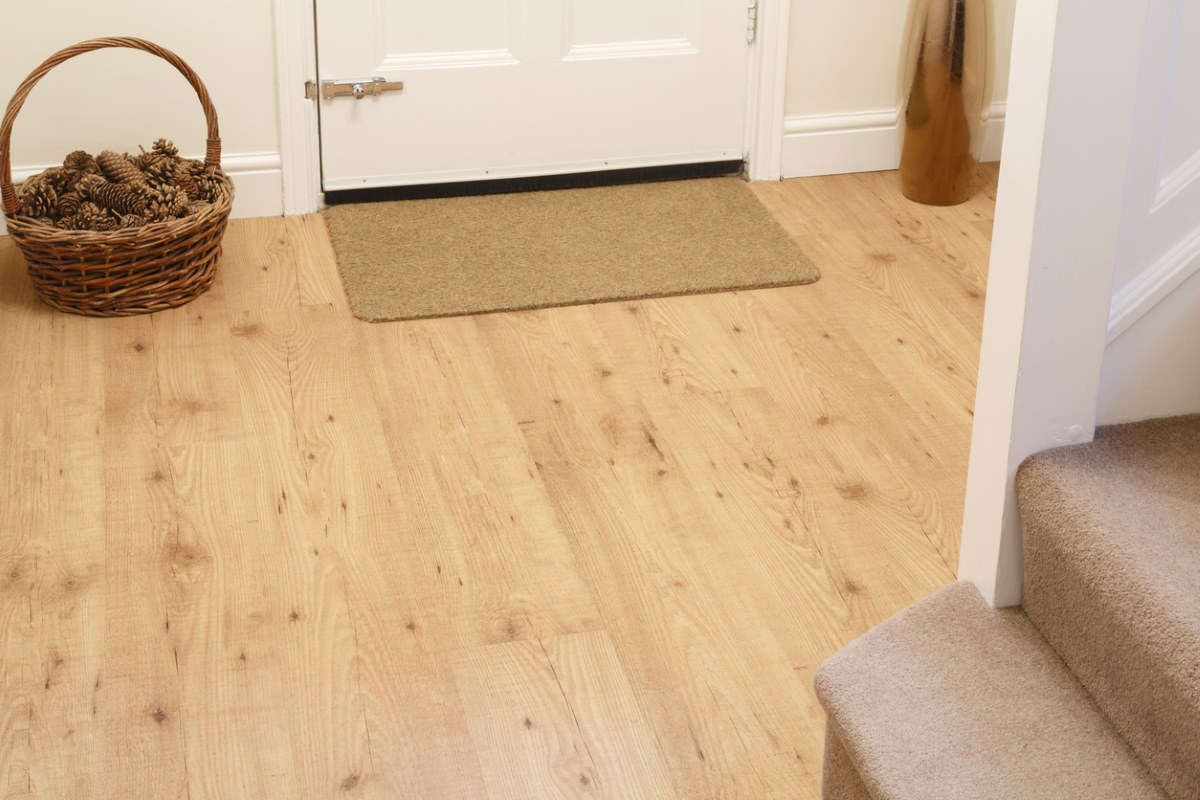
Vicky: The hallway will feel longer and more spacious if floor planks are laid down the length of hall rather than across the width. If using floor tiles, use a rectangular rather than square format.

Emile: If you like to fit carpet in your hallway, choose something suitable for heavy domestic use, with an 80% wool content. Design wise, stripes in a bold colour are elegant and timeless. Wood creates a warm inviting entrance, and it’s a practical choice too. If you have a long narrow hall choose slim floorboards; they will make the space look wider. Be aware that varnishes and lacquers can peel and flake in high traffic areas, so go for a hard wax oil finish instead. It’s just as durable, but it’s locally repairable, so any damage can be touched up without having to sand the layers underneath.

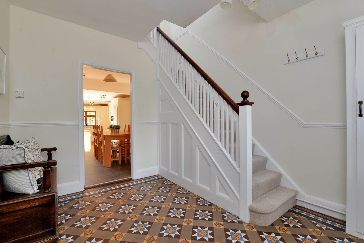
If you are lucky enough to have traditional encaustic tiles, show them off to their best advantage. They might be damaged by grease, grime, old carpet underlay or gripper rod glue. Cleaning is best left to the professionals who will use an appropriate detergent and sealant.

Semsettin: You can play with light and dark shades to emphasize the size of your hallway. If you would like to create a sense of height you can have lighter flooring/ceilings with darker walls; conversely, if you would like to create a sense of length, you can have darker flooring/ceilings with lighter walls.

3. Mirrors and artwork

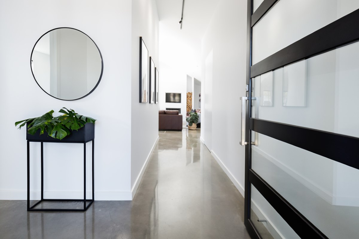
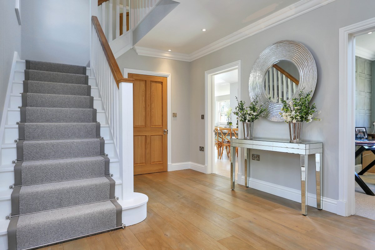
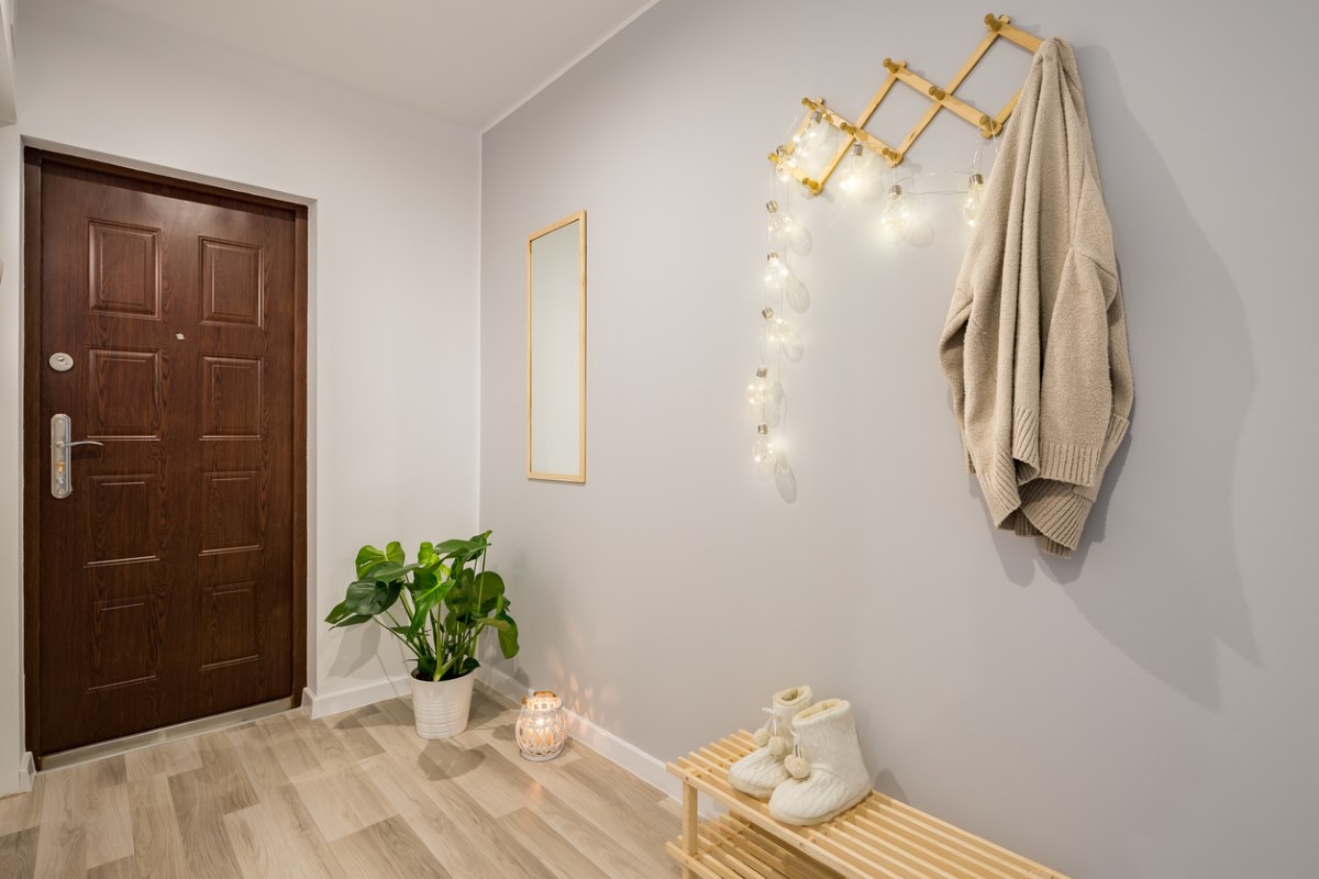
Elaine: Mirrors and artwork are another way to make a narrow hallway feel more spacious. Again, the bigger the better! Large mirrors with a light frame help draw the eye out. Artwork needs to be light and bright too with a pale frame.  Adding these accessories takes the walls back and opens up the space. There is no point having a nice mirror or artwork but having a heavy dark frame as this will close the space up again.

Vicky: Fit as big a mirror as possible. A mirror reflects the room and therefore gives the illusion of doubling the space.

Emile: Even if space is an issue, you can create a wow factor with a bold piece of art – the bigger the better. Hallways are ideal for creating a gallery of photographs.

Semsettin: A strategically placed mirror in your hallway can do wonders for the space. I would not go as far as placing them on the ceiling, but I would opt for a good quality horizontal mirror.

4. Lighting

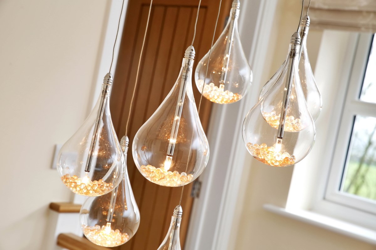
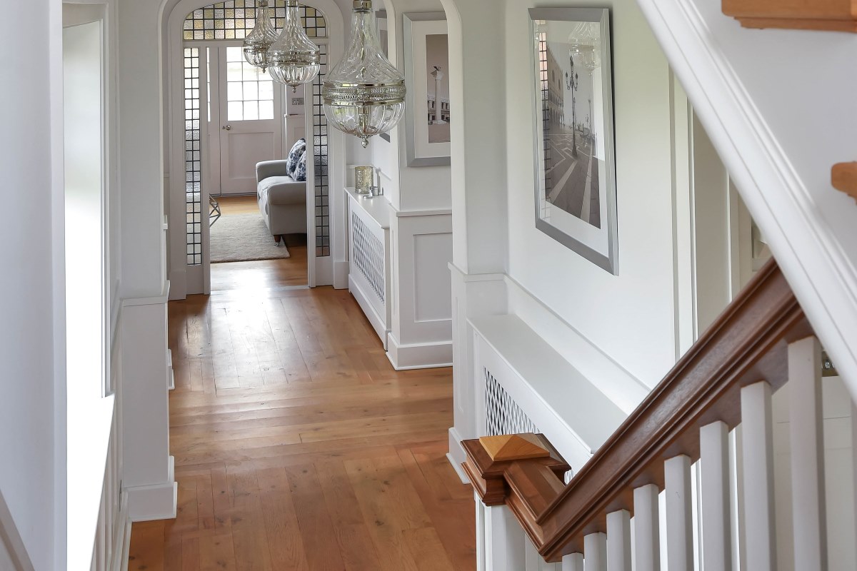
Elaine: Stairs are an important feature of any house. A quick and relatively cheap way to make this space appear bigger is to have a feature light fitting at the top of the stairs to draw the eye up. This needs to be modern and light; glass, chandelier-like fittings work best.

Vicky: Light up the hallway with ceiling lighting and consider stairwell or skirting lighting to give extra light and the illusion of space.

Emile: Choose lighting that creates an impact, as it’s an area of the house that you won’t be sitting staring at it, you can afford to be bold and go for something memorable and unusual. Layers of light work well in a hallway, highlight artwork or use decorative architraves or door architecture to add drama. Introduce floor washers to provide low-level light, and think about using table lamps to create a soft glow. If the ceiling is low, avoid pendant lights. They can make the space feel even smaller. Remember to put switches at both ends of the hall so you are never left in the dark.

Semsettin: If you are living in a fabulous Victorian or Edwardian period property, you will usually have high ceilings as you enter your home, this coupled with low hanging lights will really help you to show it off. 

5. Stair runners

Elaine: If your staircase isn’t particularly wide, try adding a modern take on the period runner up the middle to make them appear wider. Striped carpet is often a popular choice, as patterns generally work best and the stripes create clean lines. If you live in a modern house with MDF treads rather than floorboards, don’t worry – just paint the MDF; it’s only the sides that people will see. 

Vicky: A runner up the centre of the stairs draws our eyes to the middle making the stair feel smaller – the narrower the runner, the narrower the stair feels.

Emile: A runner going up the stirs looks very smart, particularly with brass or silver stair rods. When buying your runner, invest in an extra 30cms. This can be tucked under and the runner moved up a few centimetres every so often to even out wear and tear.

6. Glass stair panels

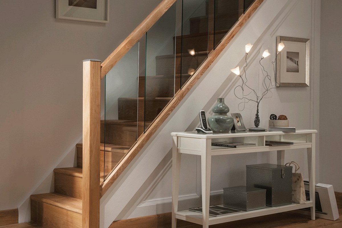
Elaine: Glass banisters can help make your stair and hallway appear larger. If you still like the traditional wood look, try a glass banister with oak on top, or for a modern look go for chrome fittings.

Vicky: Use glass panels instead of spindles to allow light to spread across the hallway and onto the stairs or vice versa.

Semsettin: If there is not a good distance from your front door to the staircase, it may be worth investing in glass to streamline your staircase. 

7. Glass front door

Vicky: A front door with a lot of glass will let in the maximum amount of daylight. There are amazing window frosting/etched designs that you can use to create character and style unique to your home. Allow as much natural light from windows and doors in the hallway and from the landing above to pour into the space so that it feels as bright and light as possible - natural light makes a room feel bigger.

Emile: Maximise the natural light in your hallway by adding glazing to the front door or a skylight in the stairwell. Many Victorian houses have a window at the half landing that can be enlarged without needing planning permission.

Semsettin: A glass door would usually increase the amount of natural daylight into your hallway, however, it is also important to weigh this against privacy.

8. Accessories

Vicky: Keep your décor and accessories narrow and simple – and consider keeping everything off the floor as this draws our eyes up to where the accessories are fitted.

Emile: If space allows, a stand-alone piece of furniture, such as bureau or a slim-line console, will help make a hallway feel “inhabited”. It also provides a home for keys and phone chargers so they don’t go astray. Vintage lockers or post office cubbyholes can work well as they are fairly shallow so don’t take up too much floor space.

Semsettin: The larger your hallway, the more scope you will have to accessorise, however, when in doubt, always declutter. 

9. Hide clutter

Vicky: If you need to store things in the hallway, keep it hidden – use built in storage and hide everything away.

Emile: A hallway is the perfect location for shoe storage. There are many off the peg solutions, which are narrow and take up limited space. Store coats in similar shallow cupboards with forward facing rails instead of usual left to right. This allows you to fit three or four coats on each rail, and you can line several rails along the wall without the need for the full 60cm hanging depth.

Utilise redundant space by building a storage unit all the way round your front door. Slim shelves at the side of the frame can be used for post, keys and phones, or for occasional storage. When you walk in you won’t see the cupboards so it helps to make the hallway less cluttered.

Semsettin: The space underneath your staircase is your go-to storage area and can be used in more ways than one: a playhouse, bookshelves, seating area, dog house or a neat WC.

10. Practicalities

Emile: There are practicalities to bear in mind when designing your hallway. Your home is your retreat, so as well as creating a good first impression, consider what you will need in the first 30 seconds of entering your house. Where will you put your keys, hang your coat, or your wet umbrella? A quality indoor doormat, is a sound investment as it will catch dust, dirt and grit and stop the surface of your floor becoming damaged. This will reduce the amount of maintenance it needs. Consider cutting a space for a mat so it sits flush with the height of the floor and doesn’t move around. It is important to create an entrance that’s as liveable as it is glamorous.